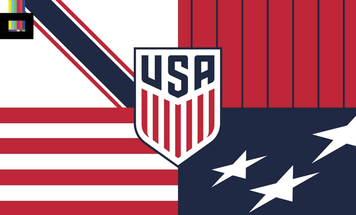
When it comes to kit design, the United States men’s and women’s national teams have historically featured a wide array of styles. Outside of the patriotic color palette of red, white, and blue (most of the time, anyway), the hasn’t been much design consistency across the various incarnations of USMNT and USWNT uniforms. And with the apparent latest set leaking to mostly negative reviews, that got us wondering – what is the ideal USA kit?
What should be the main home color? Is the US a white team? Red? Blue? Perhaps a non-flag symbolic color, like the famous Dutch orange?
Is it a plain top? Stripes? Stars? A sash?
Is the general design something that should stick and become the trademark look of the team, or should it change to something fresh year over year?
Let’s see if we can answer those questions by taking a look back at the history of national team kits, and craft a new look for the USA.
Iconic or always changing?
This first question is an important one, and it sets up the entire exercise. Should the USA adopt a permanent general theme to its kit(s), or keep trying new designs with each release as they’ve always done?
To me it’s an easy answer – pick a look/theme and stick to it. Just about every major, successful nation (and club as well) has a classic look, at least for their home shirts. While the details may shift from year to year, the overall color, design and theme remains consistent over the years. Think about it – England, Brazil, Italy, the Netherlands, Argentina – in fact, every nation that has ever won a World Cup has a definitive home kit design. In the club game, it’s the same. AC Milan’s red and black stripes (and their neighbor Inter’s blue and black). Manchester United in red over white. Boca Juniors’ unmistakeable blue with the yellow chest stripe.
The USA ought to have a signature look for the national team as well. And it’s the perfect time for a visual rebirth: in 2026 the US is the main host for the World Cup, and it also happens to be the 250th anniversary of the signing of the US Declaration of Independence.
The color
Now that we have that choice out of the way, what color is the canvas for our design? This is another massive decision, as that main color can define the identity of a national team.
This is one area where the US has been pretty consistent. Just about every official home jersey ever worn by the USMNT over the years has been primarily white. Two of their signature moments came in white shirts – the 1950 upset of England and the 2010 last minute goal vs Algeria that sent them on to the knockout stage in South Africa. In addition, the United States women were wearing white kits in 1991, 1999, 2015 and 2019 – all four times they took to the podium and raised the World Cup. The trend of national teams (and clubs) unifying the kit designs for their men’s and women’s sides is a good one. While the US hasn’t really had a great kit since they started doing this, we hope they continue outfitting both teams in the same design moving forward.
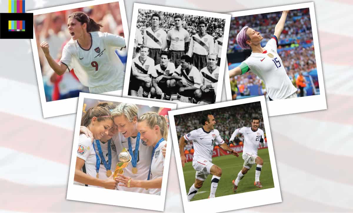
Many of the greatest moments in the history of US Soccer have come in a white kit
So historically this has been the default choice, and the program has had success in it. Plus, it jives well with the US flag, which appears as mainly white to the eye (somebody smarter than me can do the exact math) when you look at the 6 white stripes and 50 white stars. It also differentiates them from their two biggest regional rivals, Mexico and Canada, who wear green and red respectively.
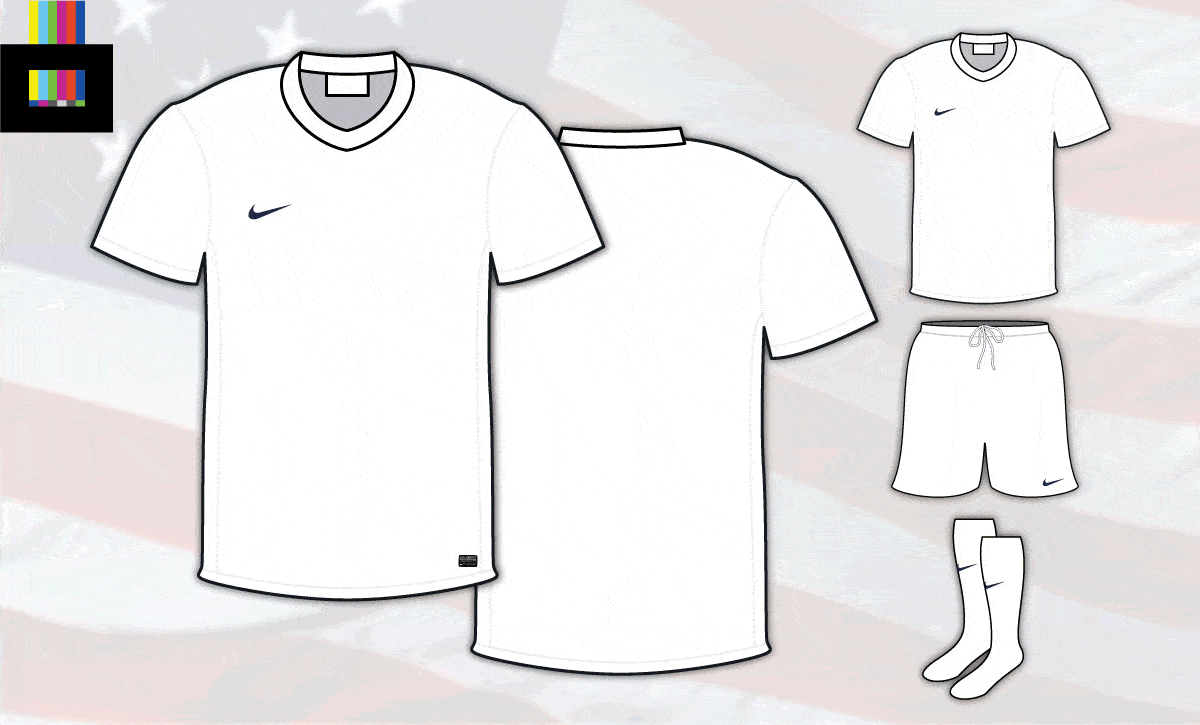
So we’re rolling forward with a white home kit as the base for the USA’s signature style. And, for the sake of simplicity, let’s say the USSF sticks with Nike.
The canvas for our new USA design
What is the design?
Here’s where it gets fun. What do you adorn that white shirt with, if anything?
In the century plus that the US national team has been playing, this is where they’ve been all over the place. Hoops, pinstripes, sashes, wavy stripes, faux denim – you name it, just about everything has been tried.
There have certainly been a few memorable – and loud – designs over the years. The aforementioned 1994 denim tops adorned with stars, 2012’s “Where’s Waldo” stripes (a look pioneered by 1983’s “Team America”, the de facto national team playing in the NASL), and 2014’s Bomb Pop look. But these all felt gimmicky. Partly because of their relative flamboyance, but also because none of them stuck. After the ’94 World Cup, US Soccer signed on with Nike, and have been at the whim of the Oregon-based sports giant ever since, totally changing shirt designs every two years or so.
There’ve been plenty of relatively plain jerseys for the USA over the years. But more often than not, instead of being a classy, dignified look, it ends up downright boring. A design element to anchor the look of the shirt is definitely the path to take. So what do we pick?
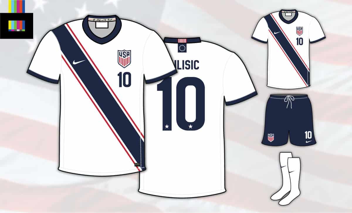
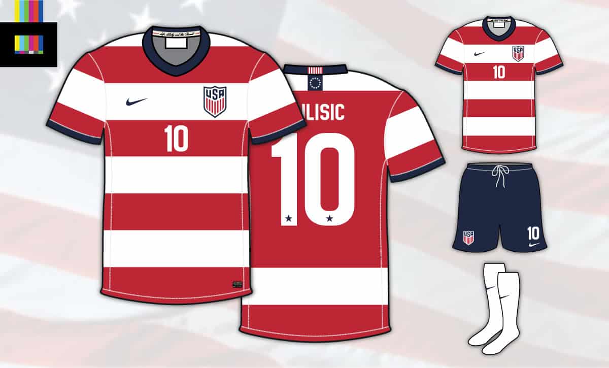
For me, the best look the USA has ever sported is the sash. As mentioned earlier, two of the biggest moments the men’s team have ever had were in a sash (1950 and 2010). The 1991 women’s world cup winners had a partial sash, in the form of the shoulder Adidas stripes that were a popular template at the time. It’s a sharp, distinctive look that is also relatively uncommon in the international game (only Peru comes to mind as a notable full-time sash-wearer).
So echoing the historic USA designs featuring the element, let’s do a left-to-right downward sash. This will also set the side apart from Peru who wears a right-to-left sash.
In the same vein, let’s make it primarily blue. The 2010 home version of the sash kit rendered the signature element in a light grey, making it nearly invisible (the blue away and red third versions of that design were superior visually, in this observer’s opinion). Making the sash a contrasting color definitely helps it stand out, but again to avoid looking like Peru (and River Plate), blue is the best choice. Let’s add some trim in red, in the style of the 2010 shirts, with a dark navy blue collar and sleeve cuffs. FIFA tends to prefer that teams wear one color head-to-toe, but that’s bland, so we’re going with contrasting blue shorts:
Ta-da! Our design is taking shape.
It’s a relatively basic sash, which could surely be filled with a detailed pattern or texture, but we’ll leave that for additional versions down the line. Let’s call this the classic version, the template for which future variations will be based upon.
Now that we have the general design down, let’s finish it off with the details. Because Nike wouldn’t put something out without going just a little bit over the top, would they?
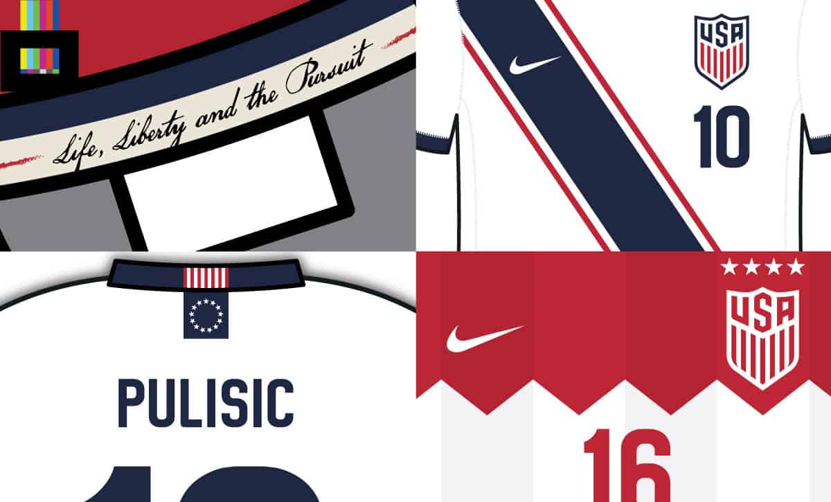
We’ve added the standard name and numbering, with stars inside the back numbers, and a Betsy Ross flag at the rear neckline. For that little bit extra, there’s a parchment-colored stripe on the inner-collar with an excerpt from the Declaration of Independence. Who couldn’t see a Nike ad campaign ahead of the 2026 World Cup with “Life, Liberty and the Pursuit (of a trophy)” as the tagline?
With all the extra bells and whistles, we’ve got ourselves a finished design:
A new signature look for the United States national teams
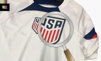
Eagle-eyed observers out there will notice we’ve slightly tweaked the USA crest. The 2016 crest update was decent – it lost the goofy flying buckyball and corrected the vexillological nightmare that was the blue stripes and red field of stars on the 90s-era crest it replaced. But the streamlined look is a bit too simple, as if something’s missing. So we’ve added back the 3-pointed top to the shield that was a hallmark of the US Soccer crest for most of it’s history, and modified the ‘USA’ font to better fit the new space:
A small change can make a big difference – seen here in our modified USA crest.
But what about…
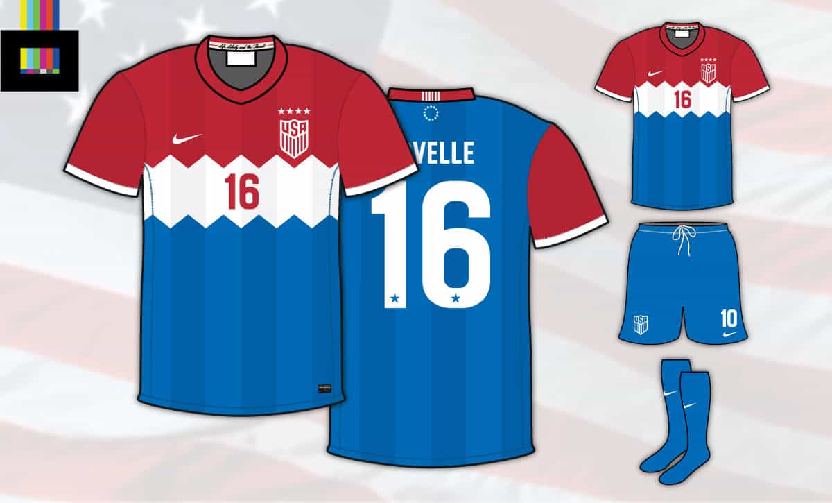
Okay, okay. We can’t just leave it with a home jersey right? With a new go-to home look locked in, the away and third kits are where you can have a little fun and try out new things with each cycle. But, to keep it simple, and well, give the people what they want, we’ve cooked up variants of two of the most popular designs from the past as the away and third choice kits for the new set:
We found Waldo!
For the away, we’ve got an adaptation of the 2012 Waldo kit. The stripes are a bit wider, so the gap on the front for the number isn’t necessary. We’ve also lost the faded sash from the original. We picked a sash for the main shirt, sashes look great, but not together with stripes. And while the OG Waldo was mostly white, this one is mostly red, with a red panel on the back for the name and number.
Who’s up for ice cream?
The third kit takes the 2014 Bomb Pop design, but makes it 50% more Bomb Pop-y. The central white stripe has a zig-zag effect, which along with tonal stripes mimic the ridges on the actual popsicle. In addition, the colors are flipped from the 2014 version, with blue on the bottom, true to the real life frozen treat. Here you can also see a 4-star logo treatment for the USWNT version.
So with that, we’ve got a brand new wardrobe for the US National Teams – filled with something traditional to last generations, as well as fanciful options that will get people talking and turn heads.
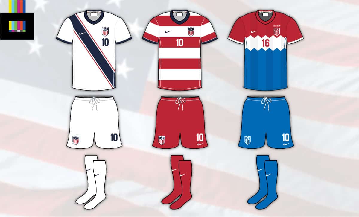
The full set, with variant shorts and socks in case of clashes
What do you think? Did we nail it? Or have we managed to do worse than Nike?
What’s your perfect USA kit?

200+ Channels With Sports & News
- Starting price: $33/mo. for fubo Latino Package
- Watch Premier League, World Cup, Euro 2024 & more

Live & On Demand TV Streaming
- Price: $35/mo. for Sling Blue
- Watch Premier League, World Cup & MLS

Many Sports & ESPN Originals
- Price: $9.99/mo. (or get ESPN+, Hulu & Disney+ for $13.99/mo.)
- Features Bundesliga, LaLiga, Championship, & more
2,000+ soccer games per year
- Price: $4.99/mo
- Features Champions League, Serie A, Europa League & NWSL

175 Premier League Games & PL TV
- Starting price: $4.99/mo. for Peacock Premium
- Watch 175 exclusive EPL games per season

110+ channels, live & on-demand
- Price: $59.95/mo. for Plus Package
- Includes FOX, FS1, ESPN, TUDN & more
30 Comments
Leave a Reply
Leave a Reply
SOCCER TV SCHEDULES APP
 |
 |
STREAMING OFFERS
 Includes: Premier League + 84 Sports Channels | |
| 7-Day Free Trial | |
 Includes: Bundesliga & La Liga | |
| Sign Up |
|

Includes: Champions League & Serie A | |
| 7-Day Free Trial | |

Includes: Premier League | |
| Sign Up |
|
 Includes: USA, NBC, FOX, FS1 + more | |
| Browse Offers |
|


Billy Joe
September 7, 2022 at 6:41 am
Blue on the third kit is wrong, overall design bad. First two good, like em, though i could do without the sash.
Leigh
September 2, 2022 at 8:12 pm
Absolutely hate hate hate hate the bombpop look.
George T
September 3, 2022 at 4:12 pm
Love the small addition to the crest…
The white kit is good, too…
Waldo looks better with navy shorts/white socks. Bomb pop uni is a bust. Hate it altogether…
Kit-Kat
September 1, 2022 at 11:42 pm
Form follows function.
“It is not known for certain when or by whom the design of the Continental Colours was created, but the flag could easily be produced by sewing white stripes onto the British Red Ensigns.”
Form follows history.
“A survey of Scottish clubs in the 1870s and early 1880s reveals that most clubs played in plain jerseys (navy, red, maroon, or green) or narrow hoops in a combination of two colours. The working class lads that took up the sport in Scotland would not be inclined to join clubs that required expensive colour combinations associated with public schools or universities that they had no connection with.”
Result: Red and white hoops.
https://en.m.wikipedia.org/wiki/Grand_Union_Flag
http://www.historicalkits.co.uk/Articles/History.htm
Sri
September 1, 2022 at 11:38 pm
I LOVED your write up, analysis, creativity, and design. Please do more kit analysis.
Brady
September 1, 2022 at 10:05 pm
I like the idea, but I think you missed the mark. I think you play off of Stars and Stripes. Home = Waldos, Away = Navy Blue with White star(s). Then the 3rd can get creative.
Danny Hernandez
September 2, 2022 at 4:39 am
I would love to speaktothedesigner and show them my idea of the mens usa uniform. Its simple yet brings out the design at a glance. Who would i speak with?
Jg
August 31, 2022 at 10:09 pm
Why do the decision makers pick ugly uniforms for the USMNT? I think the designers must have disdain for Americans to design continuous ugly uniforms that no one wants to wear in public. One of these is ok, but only ok. The other two are clown shows.
Thomas
September 2, 2022 at 4:16 am
You stole my concept
Mocha
August 31, 2022 at 10:08 pm
All of these designs are terrible, and terribly boring. The 2017 Gold Cup 3rd kit is my all time favorite. I wish Nike would think along these lines again.
Russ Liachoff
August 31, 2022 at 1:53 pm
Nike makes a terrible kit. Cheap material and design. Need to go to Adidas, New Balance, or some other company. Instead of worrying about the money Nike gives to the USSOCCER Federation, be more concerned about quality and craftmanship.
Leigh
September 2, 2022 at 8:14 pm
Under Armour… American co that makes great kits
Adam
August 31, 2022 at 12:33 pm
Love the new home jersey, but I think the away jersey would look so much better with blue shorts instead of red.
Jens Rehder
August 31, 2022 at 12:04 pm
You forgot about Guatamala in CONCACAF, but they are a light blue so that‘s ok. I like all your designs; especially the idea of having a traditional home jersey . Like the white too, it is also Germany‘s color, my second team and a good team to emulate.
salina
August 31, 2022 at 12:31 am
I like the stadium away kits we have right now. If I was to choose from this list it would be the red and white stripped with blue shorts.The plain white is boring why buy it when I own enough plain white kits the last one I actually really like but I don’t feel it a world cup kit.
Steve
August 31, 2022 at 12:27 am
The sash is the Donovan. The waldo is the Dempsey. The bomb pop is just dumb.
Ken
August 31, 2022 at 8:19 am
The sash is kind of boring and played out. Design number two is solid. Design number 3 has the jagged stripe like a Charlie Brown shirt and that’s not even the correct color of blue.
Travis
August 31, 2022 at 8:17 pm
Couldn’t agree more.
I do like the Waldo idea, but it needs a spice. Look at the USMNT fan page. There is actually pretty decent. I love never liked the sash. 3rd is just bad. So no, they did not nail it.
Travis
August 31, 2022 at 8:17 pm
Theirs*
Matt
August 30, 2022 at 11:34 pm
The first two offerings easily are our best looks – striking, simple, clean. I love the idea of stitching in the phrase “Life, Liberty,and the Pursuit..” That iconic phrase is the fundamental idea of this entire country. That we have a right to all of those things unites us as one group to that end.
TwoMorningPoops
August 30, 2022 at 7:39 pm
The Waldo is the best kit in my lifetime
Brian
August 30, 2022 at 2:39 pm
1 Yes. 2 Yes. The Waldo should be synonymous with USA Soccer; maybe switching between red stripes this go around for the men and navy for the women then switch. 3 would be great if it were a Navy Blue; not a fan of that blue
Jeff
August 30, 2022 at 12:23 am
The blue jersey with the sash is, bar none, the finest jersey the USA has ever worn. Make that the away and use that wonderful white version as the home. Make some random third every year. I never liked the Waldo, but if you want it for fan service, whatever. But yeah, the sash is the perfect element to create a permanent identity around. Clean, classic, distinctive. All things that are totally foreign to Nike, sadly. They don’t care if fans can tell what country a player is from as long as they can tell that Nike made the jersey.
Brian
August 29, 2022 at 12:50 pm
The white kit looks like it has one of those Pageant sash thingy’s to signify which state the contestant is from… so… not a fan at all. The others are good. If the players are happy, I’m happy.
John
August 29, 2022 at 11:11 am
I love all 3 uniforms presented here. All clean beautiful and not too much going on yet patriotic af.
jason
August 27, 2022 at 11:09 pm
I like the all solid dark blue of the USA hockey jerseys. Could adopt that to the football kit maybe with some red trim
Buckles
August 28, 2022 at 6:37 am
The middle one is ok with the red hoops. The home kit should be a variation of the blue stars USA94 jersey.
Too many radical jerseys every 4 years. Need a uniform look.
jason
August 28, 2022 at 11:07 pm
For sure, other sports are guilty of this. I love traidtional uniforms that don’t change over time.
I also wish football teams in europe would more frequently wear change strip that is similar to their primary colors. Man City should always have a light blue trim for instance. I think Aston Villa and WHU are pretty good. Often their away jersey is white but with the light blue and claret still in there as a trim or shorts color.
Saul Perez
August 31, 2022 at 10:47 am
Should be ask to Fans,to participate and a contest design a outfit, and choose the best!
Rich
August 31, 2022 at 11:07 pm
First 2 are great. These should be 2 of the baseline kits. A dark blue something should be in the rotation too, to keep things fresh.
Waldos should be the default red, sash should be default white. I love the sash, and I wish we’d see more of the cotising (that’s the pinstripe framing on the sash). What you did with the sash has been on my wishlist for a while.
3rd needs to be something that varies. Bomb pop works great here. Get adventurous or less-is-more with the it. Sometimes, the Waldo’s and dark blues should be 1 and 2, but that just means tweaking the Waldo balance to be a bit more white or hardwired for red shorts, etc. When the Waldos are on a break, and 3rd is the red palette, it could be bomb pop but red-tilted. Heck, the 3rd could just be variants on the chest band, emphasizing whichever color isn’t dominant in the primary and change strips.
Nice work!
I also liked the off-center stripe look in any combo, so using that with the dark blues frequently could be nice.